news

revolver magazine #158


Magazine Cover

Revolver Magazine commissioned me to create an artwork for The End section of their winter issue, a tribute to the 20th anniversary of Chuck Schuldiner’s passing.

20 years already. Time flies.
I clearly remember when I heard the news and how it affected me.
So it was a big deal for me to be able to work on a piece to express my gratitude towards Chuck and his band DEATH.

And I got lucky, my drawing ended up on the cover!

Thanks to creative director Jimmy Hubbard and managing editor Sammi Chichester.
Selected among the Best Covers of December 2021 by Konbini Arts.

Early Sketch

Final Drawing / Ink on Paper


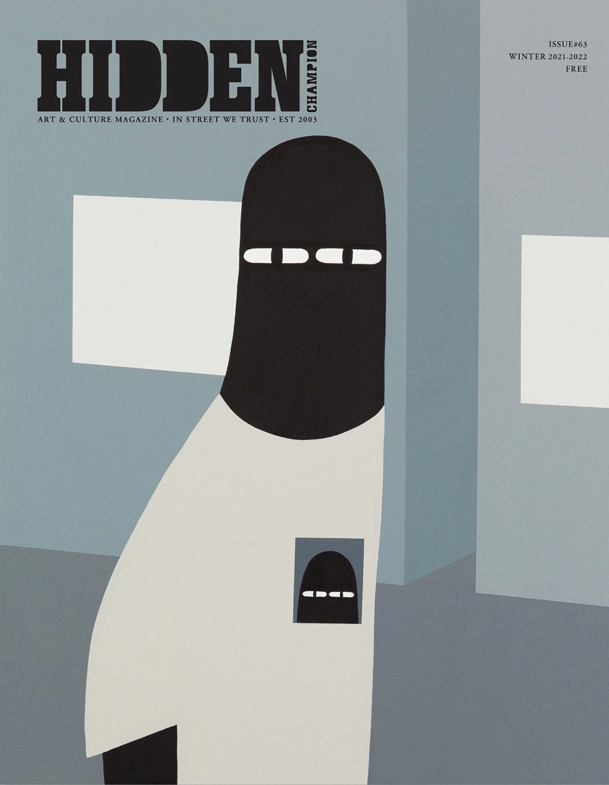
hidden champion #63


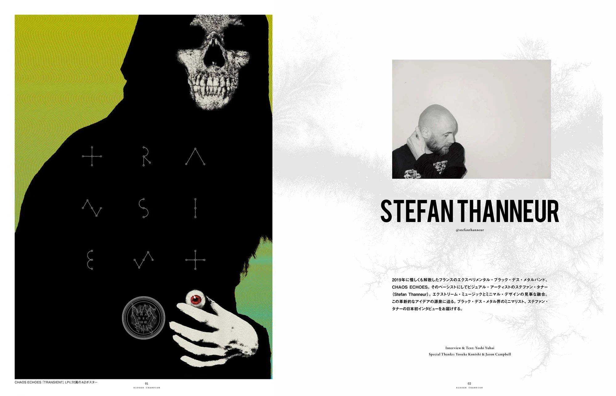
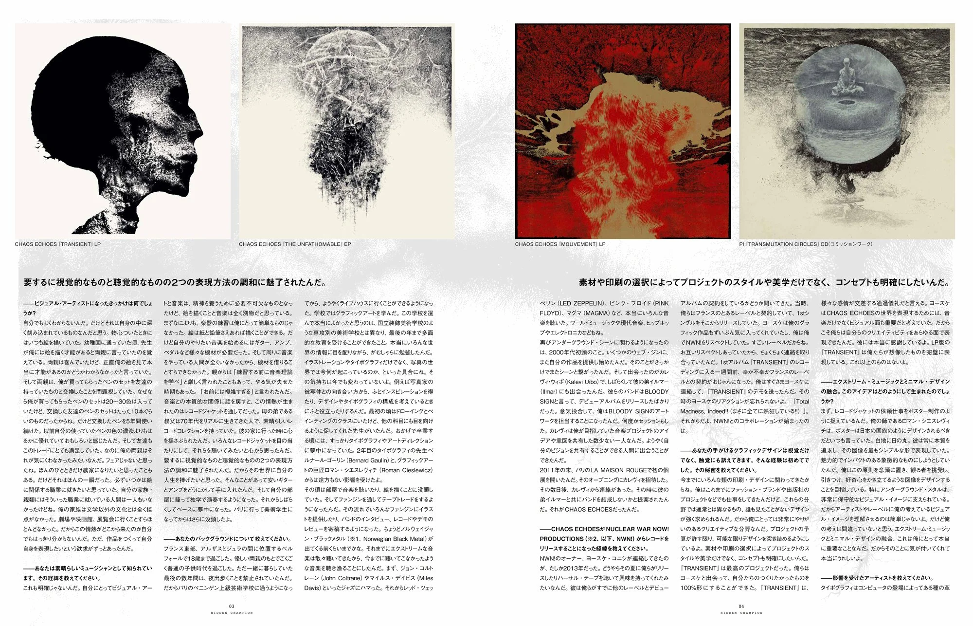
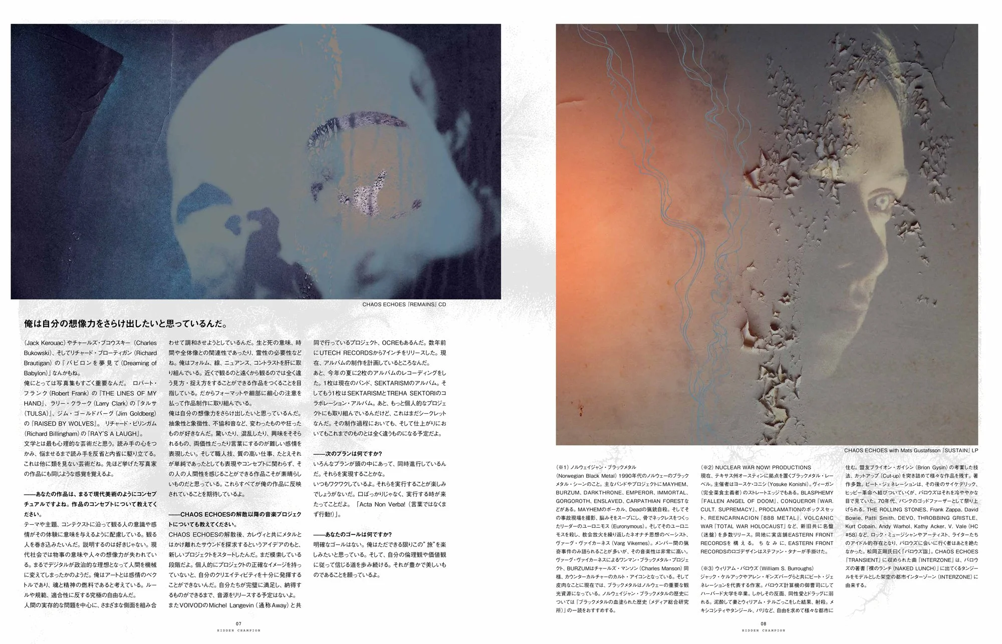
My warmest acknowledgements to Yoshi Yubai who wrote an 8-Page article about my visual work on the winter issue of Japanese magazine Hidden Champion.

Magazine Spreads

Magazine Cover


artwork for succumb


12inch LP Cover

I’ve worked – art and design – for San Francisco’s SUCCUMB once again on visual identity of their sophomore album “XXI”, to be released by The Flenser on September 24, 2021.
The first effort was great but this one is one step forward on every point. Highly recommended!
Many thanks to Harry, Derek, Cheri & Kirk for their trust and their commitment. Always a pleasure!
Article about SUCCUMB and my contribution on Heaviest Of Art.


year of no light


Renowned South-Western French post-metal entity YEAR OF NO LIGHT finally rose from its 8-year hiatus with a brand new album entitled “Consolamentum”, released by Berlin based label Pelagic Records on July 2nd, 2021.

No doubt that I was beyond happy and über-motivated when these guys asked me to work on the visual identity many moons ago.

This close and long collaboration led us to build something I couldn't have imagined. That's what made this experience very special and unique to me.

Ambition was high when we started our thought. The established band wished to use the fact that they haven't released anything for the last 8 years to rethink their visual identity not only for the new album but also as a band.

The label's desire to reissue their entire back catalog and produce a box set of their complete discography ended to convince us that it was the right time to propose a renewed imagery, and that we had a lot of work to do!

I first asked band members to take some time to think and pick up a selection of visual references – even sometime literary – that they could relate to their own idea of the band and its music. This exercise defined our art direction, based on brutalist architecture and 1970s optic art, accompanied by a refined yet impactful minimalist typographic work and a one-color palette: red.

Add a supportive enthusiastic record label ready for doing special packaging and you get the whole picture.


EMBLEM

The idea was to stick to what have been previously done. A graphic and symbolic expression of light & sound waves.

I designed this new version of their emblem by revisiting the optic art of the 70s, heavily inspired by Vasareli's work.

It now allows a way more versatile use and impact, however its size can be.
Year of No Light’s New Emblem

CONSOLAMENTUM

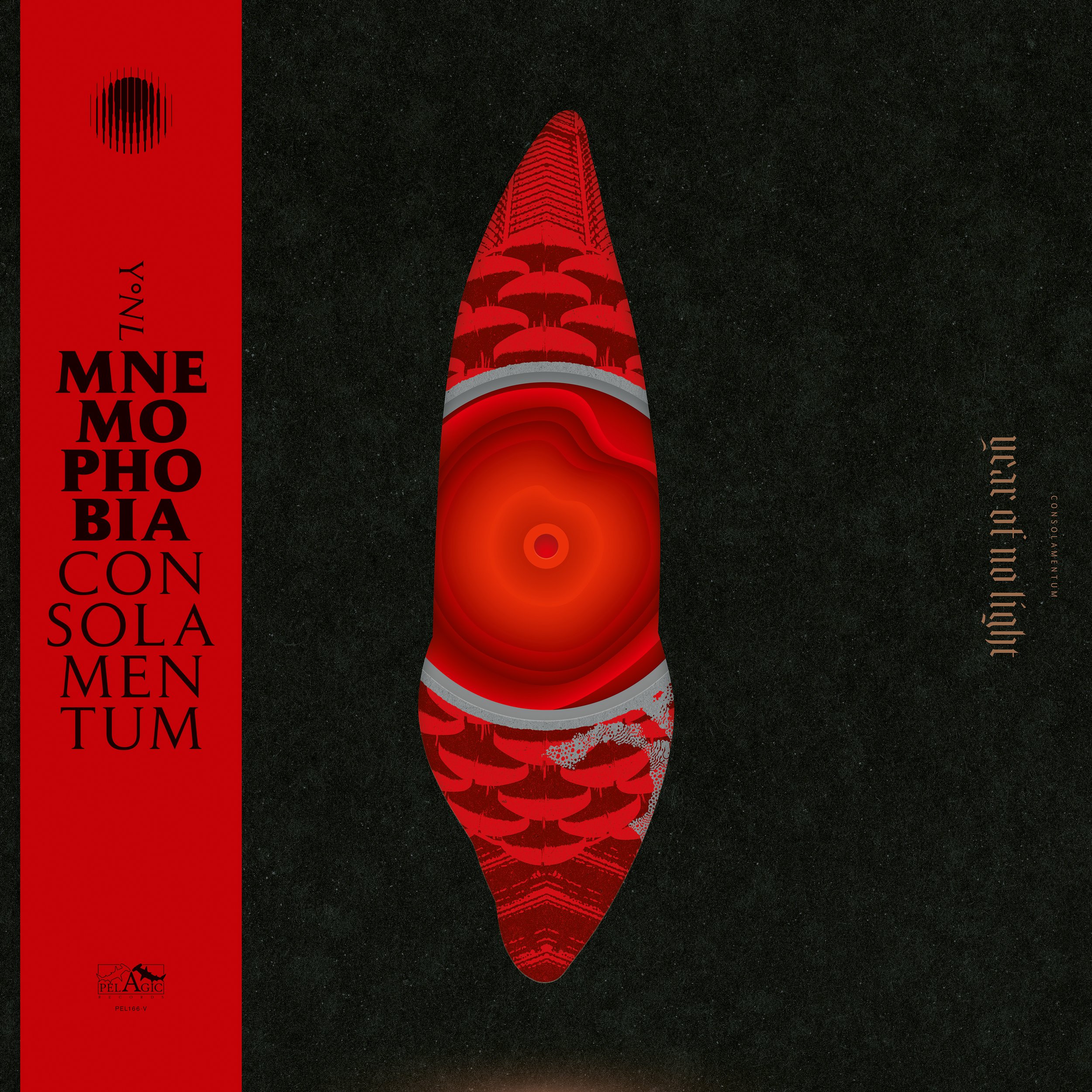
My intent was to create something different from previous album covers, and to avoid typical visual codes of the musical genres the band is usually related to. Architecture, Brutalism especially, was an unexplored field to me – which was a good thing as I usually work around rather organic themes. But I also wanted to express instrumental music through abstraction, and bring a very graphic and contemporary, almost pop art feel to it.

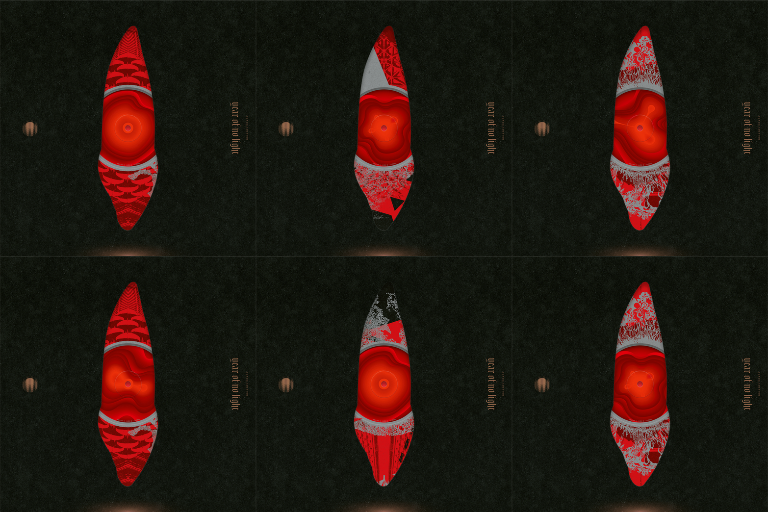
The opportunity of a special die-cut on the front cover guided me to the idea of playing with all printed parts of the vinyl edition.
Thus, center labels, inner sleeves with center holes, and the front of the gatefold sleeve would all be essential to create the final cover art, the whole picture.
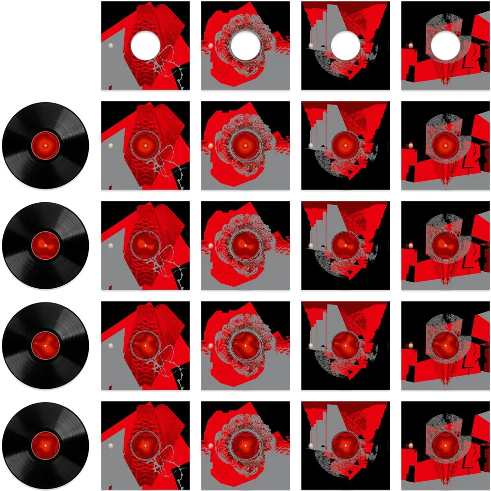
Even more exciting and playful, with a 2-LP album, it meant four center labels and four sides of inner sleeves with center hole to offer 16 variants of the cover art.

Cover design needed to be an intriguing and minimalist setting, with the die-cut as main element, to contrast with the inside elements.
The die-cut shape, evoker of some kind of unearthly and powerful monolith, was designed based on a canine tooth, bringing the ambivalence of its shape and meaning: the beauty of its conception, something very smooth and streamlined, but also a dangerous tool.

The 16 Variants of the 12inch Gatefold Cover Art

12inch Gatefold Sleeve / Back Liner

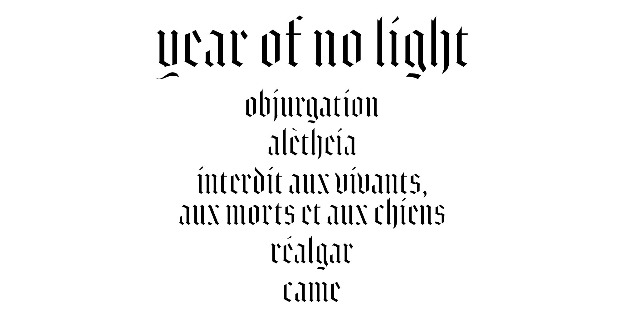
Customized Gothic Typeface for Band Name & Track Titles

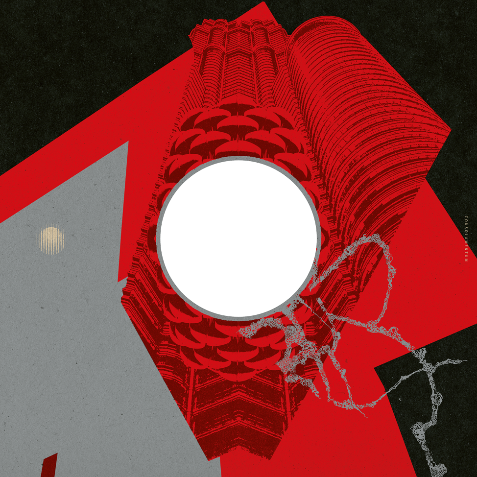
For inner sleeves, I worked on shapes of brutalist architectures and started to deconstruct, colorize and mix them into abstract graphic compositions.

12inch Inner Sleeves with Center Hole

To match them with the inner sleeves’ artworks while having their own aesthetics, center labels have been conceived with curves and color shadings to bring a psychedelic touch and look like some kind of glowing membrane.

“Consolamentum” 12inch Center Labels + Combinations of Center Labels & Inner Sleeves

Inside spread of the gatefold sleeve was also an important part. We wanted something more illustrative and spectacular.

12inch Gatefold Sleeve / Inside Spread

12inch Gatefold Sleeve / Inside Spread (Details)

Note that the CD edition is similar to the vinyl edition, with the addition of a folded poster, and 4 inserts instead of the LP inner sleeves.


MNEMOPHOBIA BOX SET

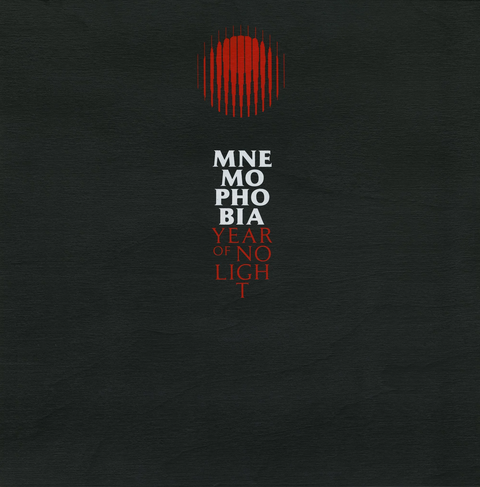
Cover of the Wooden Vinyl Box Set

By a common desire for coherence and strong graphic identity, band and label quickly agreed with the idea of unifying the visuals of previous albums by color.

All previous packaging designs were reworked through the color palette defined for this box set: red / black / and shades ranging from beige-ivory to yellow-orange. An obi-strip was created to distinguish each album contained in the box.

All Album Covers with Obi

Other exclusive elements were designed in accordance with this visual charter: “Mnème”, a double LP compiling the recordings of various EPs and collaborations, a slipmat (for vinyl edition), a woven patch and a metal pin representing the new emblem, as well as a silkscreen printed poster (for vinyl edition only, substituted for an offset printed folded poster in the CD edition).

Artwork & Packaging Design of “Mnème”, 12inch Gatefold 2LP Exclusive to the “Mnemophobia” Box Set

12inch Slipmat

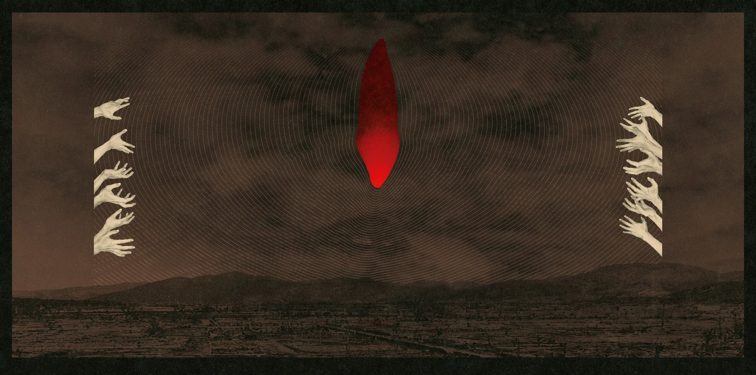
2-Color Silkscreen Printed Poster