souffle continu records
SOUFFLE CONTINU RECORDS
TREASURES FROM THE FRENCH UNDERGROUND SINCE 2014
The desire of Bernard Ducayron & Théo Jarrier with their label Souffle Continu Records is to provide worldwide access to out-of-print recordings from the French underground musical heritage.
Even Though a few albums are also reissued on CD, the main and most beloved physical format for Souffle Continu Records is vinyl.
Having become unobtainable or unaffordable, these albums are restored and remastered, both sound and visual, with care and ethics.
Each original packaging is digitized, cleaned and retouched, sometimes even reworked.
As for the music, the idea here is not to distort the original work but to give it a second lease of life, meeting the standards of our time, while paying attention to preserving the spirit in which was created the musical work and its physical product.
The other exciting challenge of this art direction is to bring a strong identity to a label covering several musical genres. Affirming a singular identity while showing its cultural openness and diversity, without effect or demonstration, but rather through a simple and respectful contemporary aesthetics.
Here is some sort of visual retrospective of the label’s first ten years, through the graphic design of its identity and catalog, and their main features.
THE ORANGE-RED DOT
In the beginning, Souffle Continu was a record shop, so I had already done a part of the work a few years earlier. But it was necessary to adapt and adjust this work to the needs of a record label.
I wanted the label to get a distinctive sign, very versatile, minimalistic and easily usable in any kind of context.
So many things have round shape in the music world, from the way to write notes to the shape of vinyl records, tapes or compact discs. The dot was an obvious choice. Same as for the color. What color do you choose when you want to draw attention?
The “ffl” inside has been taken from an early proposal of the label’s name logo. It reminded Théo & Bernard of something musical that fitted with their idea of the label name’s meaning.
A very classic typography for the name, without the space between the words for sole eccentricity. The idea was to appear timeless, and to convey the notions of quality and integrity without evoking any aesthetic specific to a musical genre.
Akzidenz Grotesk font has been chosen for everything related to the label.
OBI
Although it has become an increasingly trendy element for labels over the years, the Obi strip was not so common when we decided to use this typically Japanese marketing trick as a crucial part of the label’s products, in order to establish the visual identity and respond to the marketing needs of the label without altering the original artwork of the reissues.
The folded Obi that we use allows us to work on the front side in relation to the cover art, and to integrate a description with texts and other legal notices on the back side.
FFL034
FFL082
FFL087
FFL044
FFL038
FFL081
FFL035
FFL078
FFL056
FFL022
FFL039
FFL024
FFL036
FFL079
FFL059
FFL023
FFL041
FFL005
BOOKLETS
Another asset at Souffle Continu Records is Théo Jarrier’s ability to document the label’s releases with rare iconography and writings from music experts & other witnesses of the French underground.
Since the beginning, most releases of the Souffle Continu Records catalog offer an exclusive insert or booklet, reinforcing the label’s prestige.
The choice on illustrations is extremely selective in order to get a very impactful visual expression. Color palettes are based on original cover art for obvious global graphic cohesion.
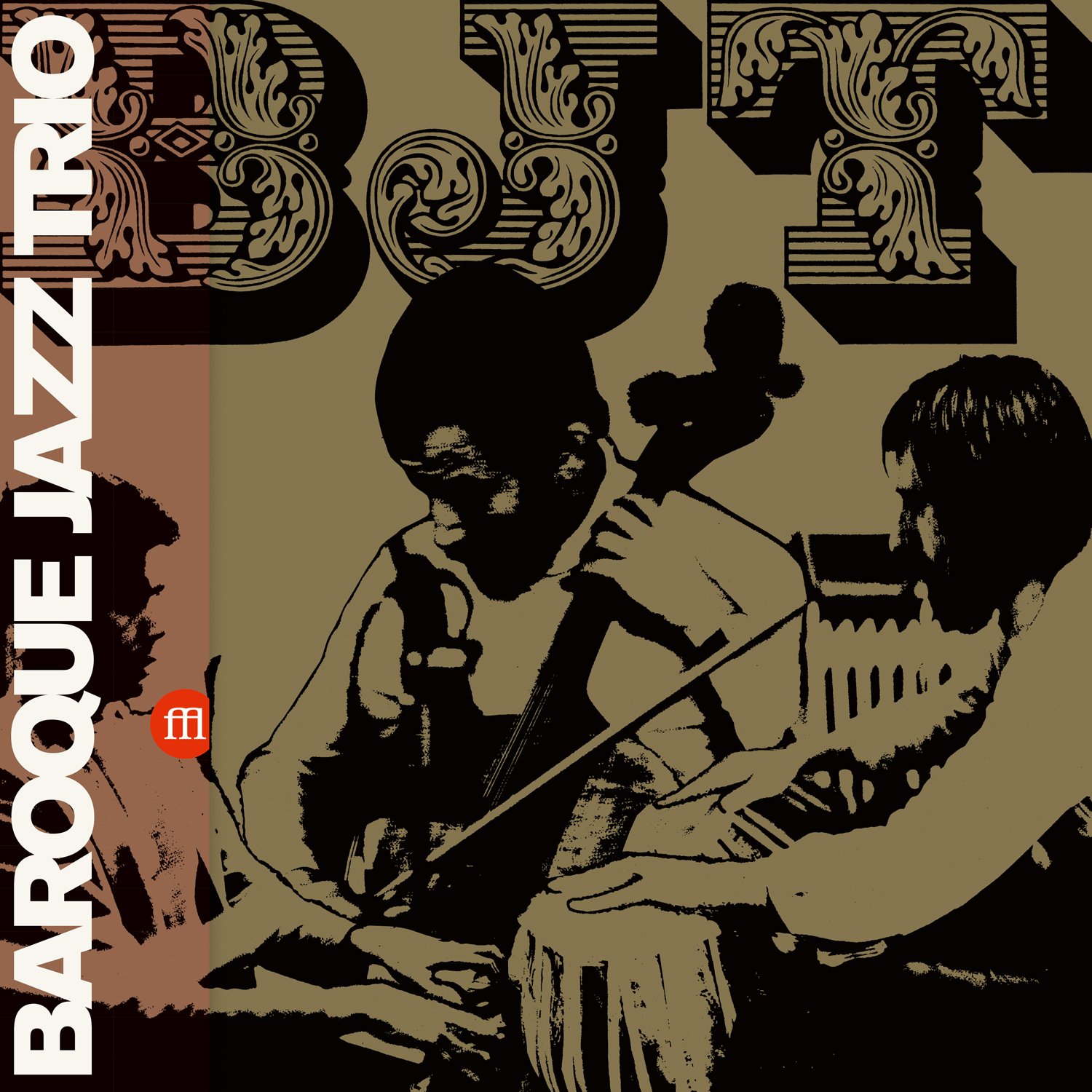
FFL031 / FFL032 / FFL033
FREE JAZZ WORKSHOP / WORKSHOP DE LYON
Booklet Cover + Spreads
FFL049
JACQUES THOLLOT
Quand Le Son Devient Aigu, Jeter La Girafe à La Mer
Booklet Spreads
FFL038 / FFL039 / FFL040 / FFL041
DHARMA
Booklet Cover + Spreads
FFL052
PERCEPTION
Perception And Friends
Booklet Spreads
FFL081
VIDEO-AVENTURES
Musiques Pour Garçons Et Filles + Inédits
Booklet Cover + Spread
FFL063
ALAIN BELLAÏCHE
Sea Fluorescent
Booklet Spreads
FFL080
KRISTEN NOGUES
Marc’h Gouez
Booklet Cover
FFL019 / FFL020 / FFL021
COHELMEC ENSEMBLE
Booklet Cover Spread
FFL077
MAAJUN
Vivre La Mort Du Vieux Monde
Booklet Spreads
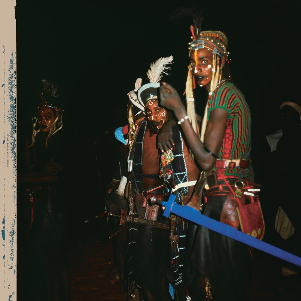
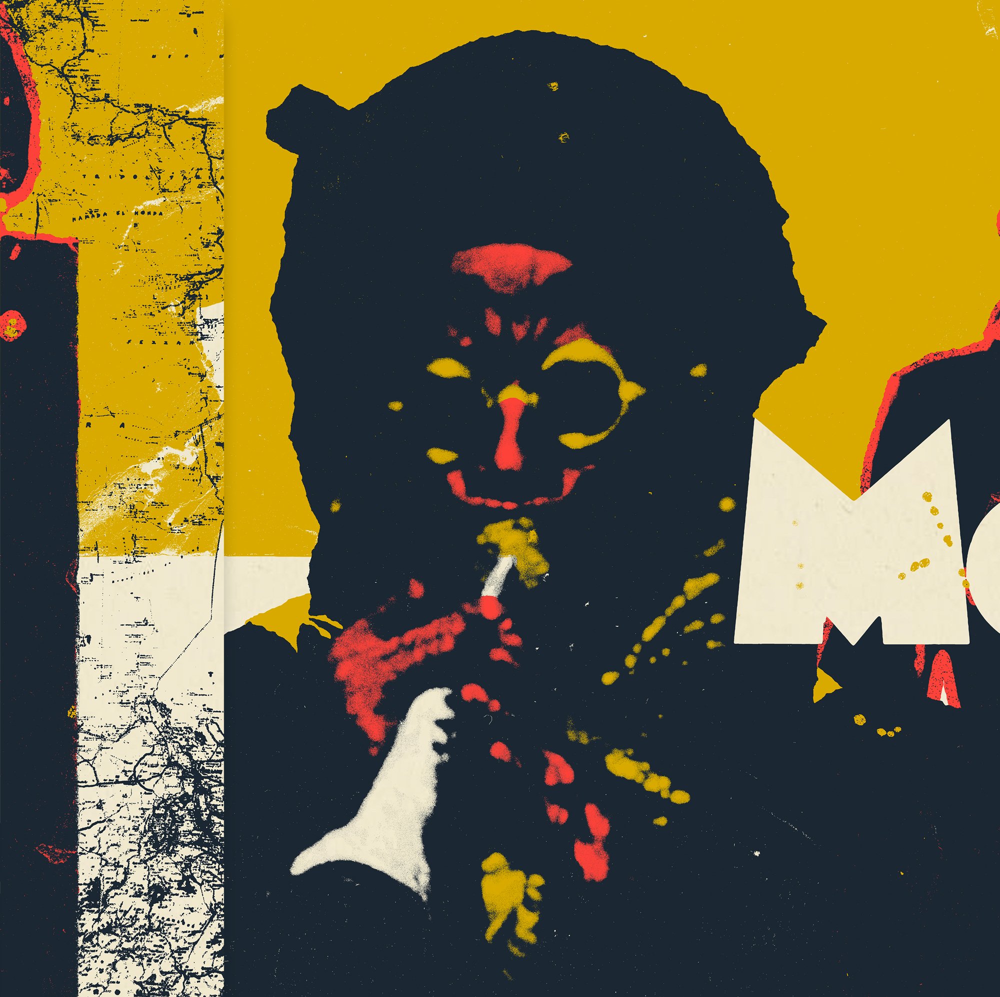
MOSHI
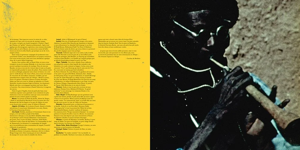
Moshi was the label’s most ambitious release at the time.
This album was already a huge excitement to work on for what this milestone represents within experimental & jazz genres, but the work done by Théo & Bernard has resulted to the making of the most complete edition anyone can hope for, enliven with a 20-page booklet including rare pictures, sheet music & original liner notes, and a DVD of Caroline de Bendern’s movie À l’intention de Mlle Issoufou à Bilma, documenting this incredible African journey.
Undeniably the first impactful release which helped to put Souffle Continu Records on the map.
FFL015
BARNEY WILEN
Moshi
Cover with Obi + Gatefold Inside Spread
FFL015
BARNEY WILEN
Moshi
Booklet Cover + Spreads + Back Cover
FFL015
BARNEY WILEN
Moshi
Bonus DVD Cover
FFL015-ART
BARNEY WILEN
Moshi
Elements of the album’s limited Art Edition, with exclusive 7inch Vinyl and numbered & signed screen printed trifold outer wrap.
NEW ALBUM ART
Souffle Continu Records has been quickly able to work on special projects based on sources from exclusive and/or rare unreleased material, or from CD only releases.
This involved a need for new artwork, which would apply on various formats such as a twin release of live recordings or a multiple vinyl box set representing a specific era of a band.
I have done most of these album artworks, and for some projects I had the chance to work with other visual artists and photographers.
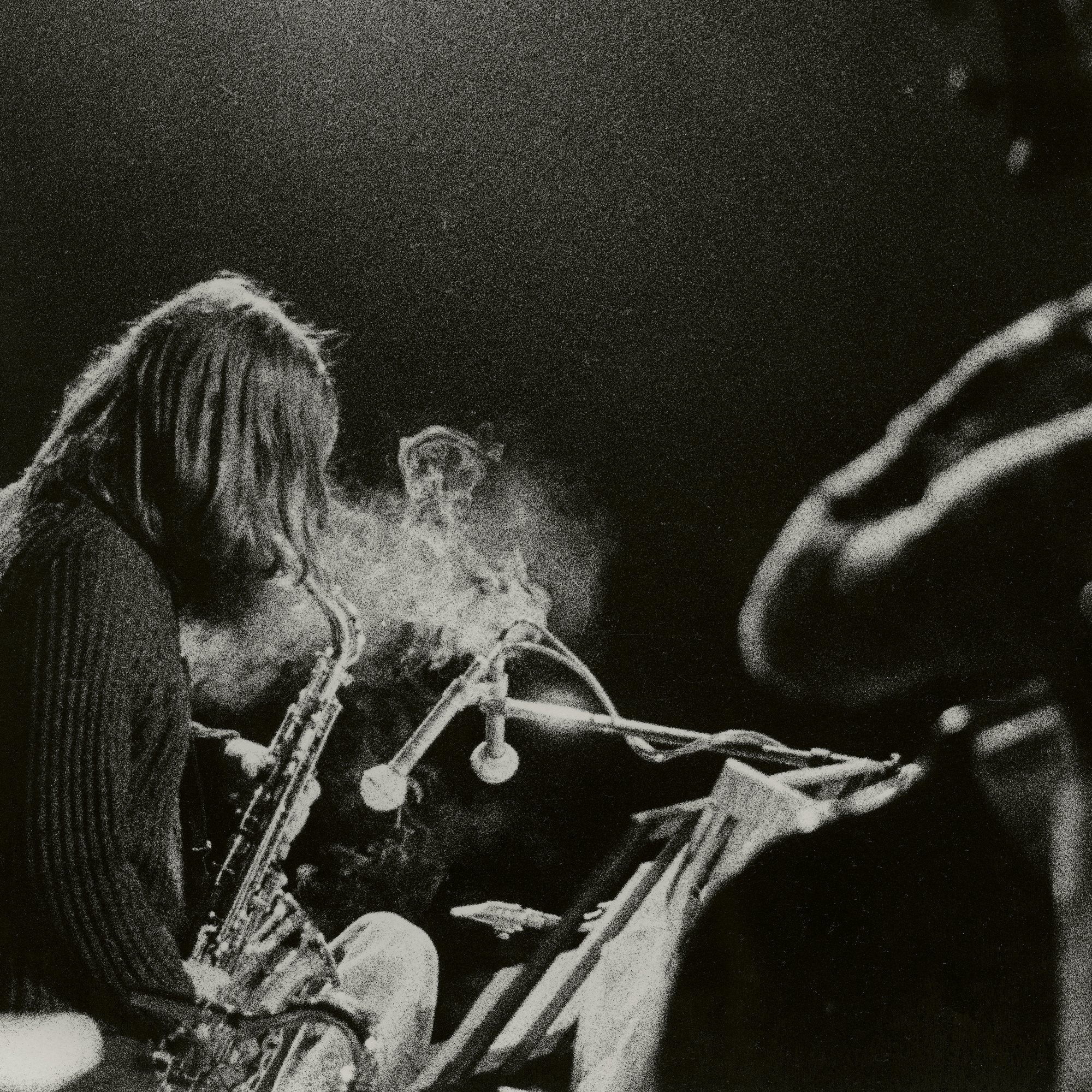
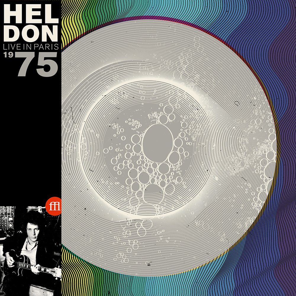
FFL007
HELDON
Live in Paris 1975
Cover with Obi + Color Vinyl
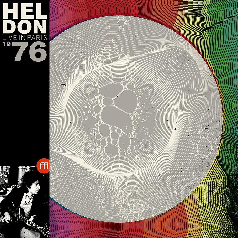
FFL008
HELDON
Live in Paris 1976
Cover with Obi + Color Vinyl
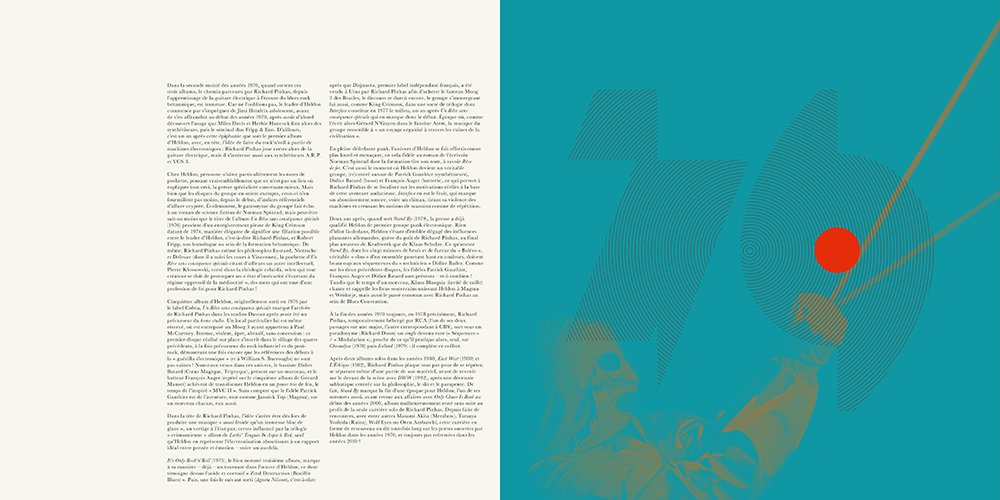
FFLBOX001
HELDON
1976-1979
Box Set Cover
FFLBOX001
HELDON
1976-1979
Box Set Booklet Cover & Spreads
FFL014
BIRGÉ/GORGÉ
Avant Toute
Back Liner + Cover with Obi + Insert + Color Vinyl
FFL027
JEAN-FRANÇOIS PAUVROS & GABY BIZIEN
Pays Noir
Cover with Obi
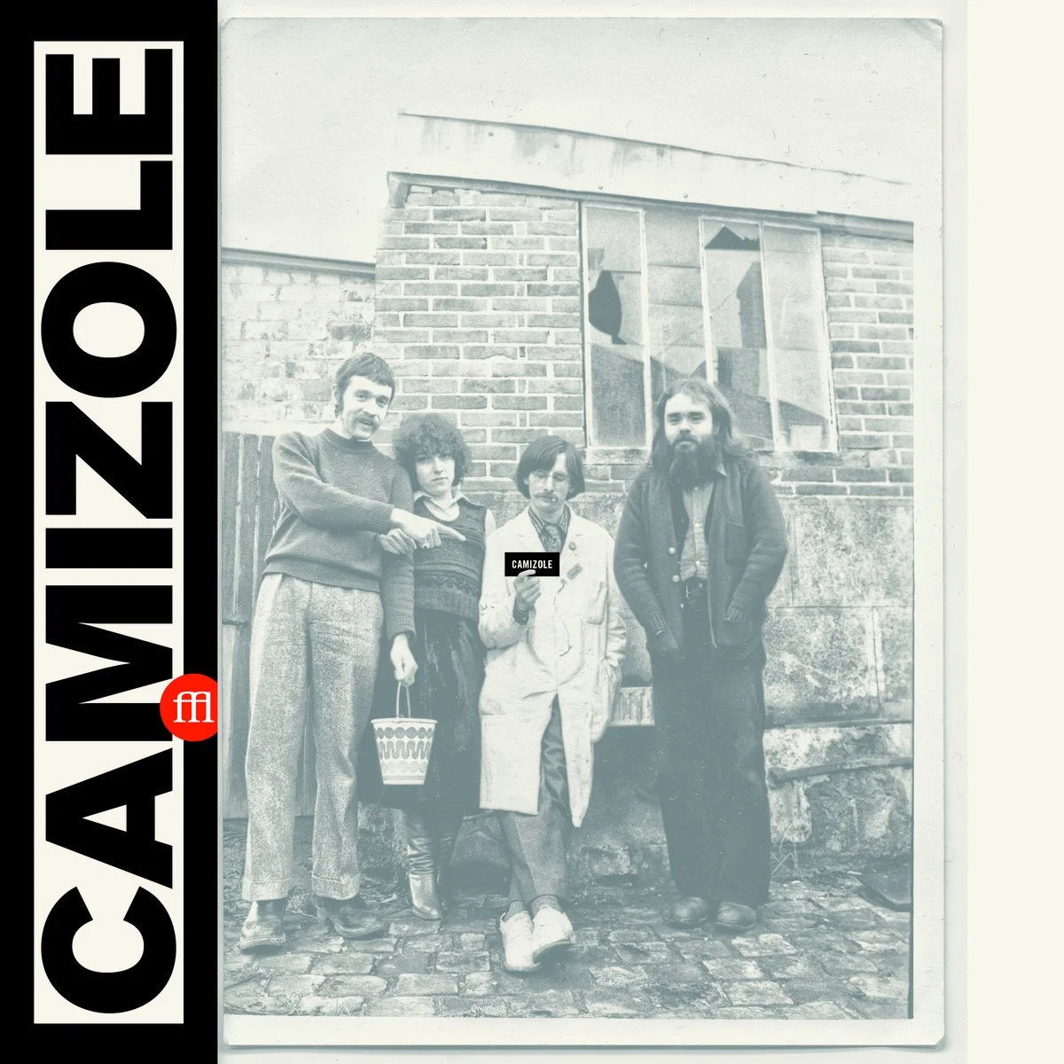
FFL029
CAMIZOLE
Cover with Obi
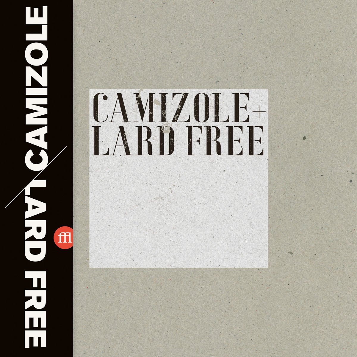
FFL030
CAMIZOLE/LARD FREE
Cover with Obi
FFL024X
EMMANUELLE PARRENIN
Maison Rose + 17 Décembre/La Forêt Bleue
Slipcase Cover with Hype Sticker
Illustration by Charles Berbérian
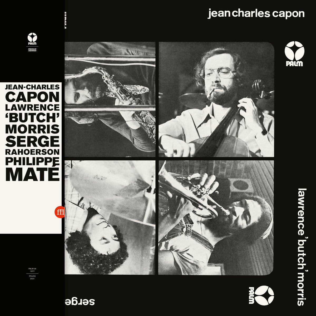
PALM REDUX SERIES
Knowing that the label would reissue not one but many releases from Jef Gilson’s legendary Palm label, Bernard & Théo decided that the entire series would get a special treatment.
Again, the aim was to faithfully restore the album’s original artwork, and use the extra parts of the packaging such as the obi strip and the booklet to apply the principles of the series visual identity.
Using black & white as palette like most of Palm album covers, obi and booklet graphics are all simply based on the same grid, a black background and a big horizontally centred white block, with a common font.
FFL088 | PALM REDUX SERIES
BAIKIDA E.J. CARROLL
Orange Fish Tears
Cover with Obi
FFL088 | PALM REDUX SERIES
BAIKIDA E.J. CARROLL
Orange Fish Tears
Booklet Back Cover + Cover + Spreads
FFL076 | PALM REDUX SERIES
FRANÇOIS JEANNEAU
Une Bien Curieuse Planète
Cover with Obi
FFL075 | PALM REDUX SERIES
PHILIPPE MATÉ/JEF GILSON
Workshop
Cover with Obi
FFL072 | PALM REDUX SERIES
JEAN-CHARLES CAPON
LAWRENCE “BUTCH” MORRIS
SERGE RAHOERSON
PHILIPPE MATÉ
Cover with Obi
FFL071 | PALM REDUX SERIES
JACQUES THOLLOT
Watch Devil Go
Cover with Obi
FFL068 | PALM REDUX SERIES
JEF GILSON
Madagasy At Newport
Cover with Obi
FFL067 | PALM REDUX SERIES
SYLVIN MARC/DEL RABENJA
Madagascar Now
Cover with Obi
FFL066 | PALM REDUX SERIES
MALAGASY/GILSON
À Madagascar
Cover with Obi
ART EDITIONS
On selected albums, the label offers a very limited edition with a special color vinyl, a screen printed trifold sleeve wrap with exclusive art, as well as other bonuses.
We created a template for this trifold sleeve so that the art wraps around the front and back of the cover, and a small flap on the left recalls the obi.
Total freedom to visually express the album's world and its impact on my feelings.
Screen print on noble thick papers…
Always a cherished pleasure!
You can see large size of these artworks here.
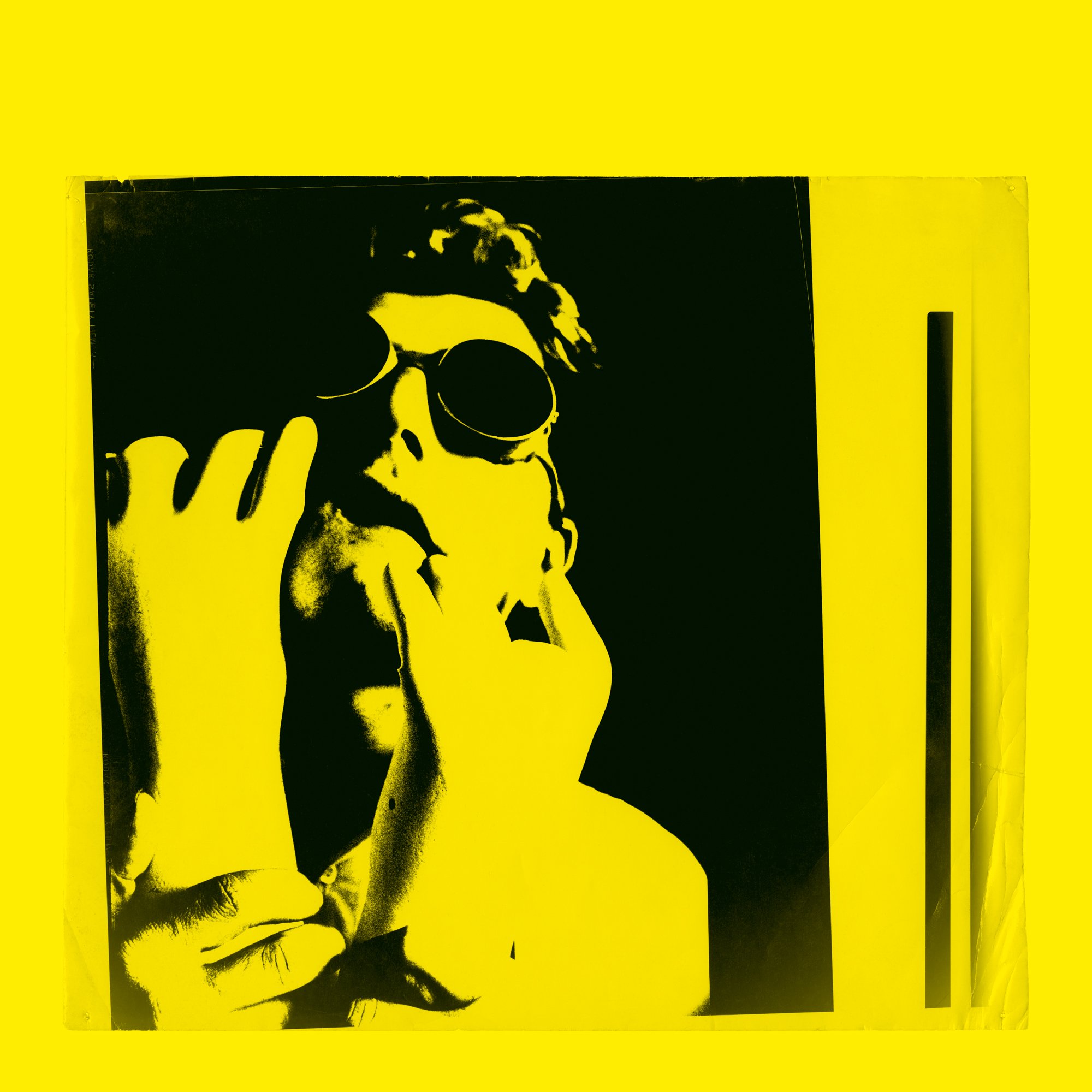
FFL088-ART
BAIKIDA E.J. CARROLL
Orange Fish Tears
Screen Printed Trifold Sleeve Wrap Folded as Cover
FFL060-ART
LE THÉÂTRE DU CHÊNE NOIR
Aurora
Screen Printed Trifold Sleeve Wrap Folded as Cover
FFL049-ART
JACQUES THOLLOT
Quand Le Son Devient Aigu Jeter La Girafe à La Mer
Screen Printed Trifold Sleeve Wrap Folded as Cover
FFL015-ART
BARNEY WILEN
Moshi
Screen Printed Trifold Sleeve Wrap — Folded as Cover
